Nov 30, 2012 0
Oct 14, 2012 0
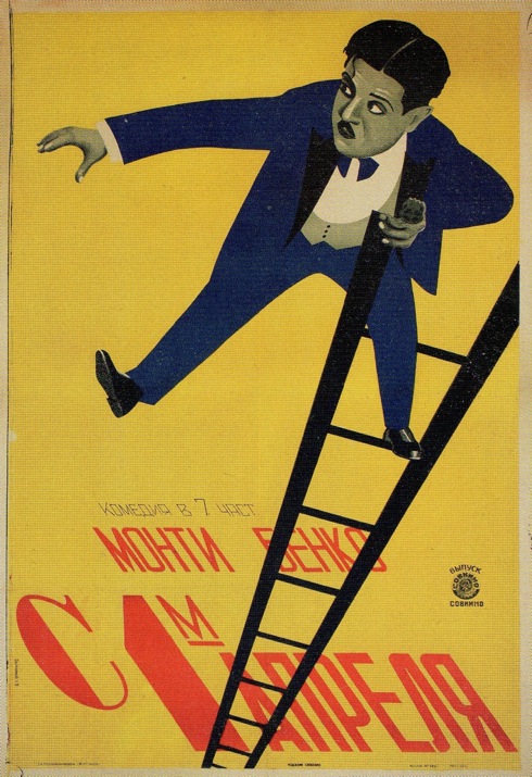
Not Charlie Chaplin!
A powerful example of cinematic expression in graphic design, this poster is also interesting because the man at its center serves as an illuminating decoy. Though a dead ringer for Charlie Chaplin, the actor pictured is actually Monty Banks, and most likely this is a scene from Bank’s 1926 film Atta Boy, which prominently features a scene of him dangling off a ladder in the back of a car.
The reason that a marginal actor like Banks was featured abroad was largely a result of the marketing strategies of the distributors. Films made by independent American actor/director/producers like Banks, Charles Ray, and Richard Talmadge, which played only in a few theaters in the United States due to tight control of the major theater chains by the large producers, enjoyed success in the USSR—especially since they were considered harmless screwball fare that lacked a political agenda. As a result, some films that were barely noticed in their home country occasioned the creation of top-notch Russian posters like this one. This poster is unsigned, but has been attributed to the incredible Stenberg Brothers.
Jul 21, 2012 0
Qui? Quoi? Quand? Ou…. ?
Here is a poster for the movie Les Vampires by Louis Feuillade. It is a signed lithograph currently on display as part of the permanent exhibition at the Cinematheque Francaise. Fun fact: the actress Musidora depicted here actually worked at the ticket booth at the Cinematheque Francaise until 1943.
Musidora, who not only starred in films but also directed and produced them, is worthy of a blog post in her own right (and a New York City retrospective for my money). Here’s a brief glimpse from Soleil et Ombre [1922], one of the two films that she directed that has survived:
May 30, 2012 0
Jean-Michel Folon, Cannes Film Festival Poster [1979]
In honor of Cannes, here’s one of my favorite editions of the annual Cannes Film Festival poster by an extremely whimsical and popular artist: Jean-Michel Folon. Born in Belgium in 1934, Folon attended architecture school, but abandoned that career in the 1960s and moved to New York and then Paris to work on his art. He quickly distinguished himself as a talented painter and was known for watercolor paintings that featured wide graduations of color and recurring symbolic figures with simple outlines. Two of the most frequent motifs in his work were a featureless, hat-wearing man with glowing eyes in a deserted urban landscape, and a bird alighting from an outstretched hand.
While producing a large body of work in many mediums, such as watercolor, silkscreen, sculpture and glass, Folon is best remembered for his iconic posters and his animation for French television. His designs for Tarkovsky’s Stalker, Woody Allen’s September, and Roman Polanski’s Quoi? [Forbidden Dreams] are especially memorable. He also acted in several films. With his friend, composer Michel Colombier, Folon created the credit titles for Antennae 2, the French public television station, which were broadcast from 1973 to 1984.
Here, for the 1979 Cannes Film Festival, he uses the same little hat-wearing character as seen in the animated Antenne film and a complex twelve color background gradient, which he obsessively supervised until it was printed to his satisfaction. In his naive, surrealistic style, he transforms the hat into a movie screen with a third eye glowing in the forehead. Yes, cinema does help you reach a higher consciousness! Towards the end of his career, he moved to Monaco and devoted himself to sculpture and designing for Amnesty International and other human rights groups.
Nov 2, 2011 0
Mademoiselle Charlot [Chaplin, 1915]
I love this poster for the French release of Chaplin’s short film A Woman, in which he cross-dresses to fool the father of a girl he met in the park. He even shaves his iconic moustasche, and I have to say, he makes quite the handsome woman!
You can view the film here and here.
P.S. Anyone know anything more about the Himalaya Film Company? They seem to have distributed almost all of Chaplin’s early films in France.
Jul 6, 2011 2
New Orleans [Arthur Lubin, 1947]
This movie, while short on decent story and plot, is a real treat for jazz fans.
The Swedish poster (designed by Eric Rohman) is a snappy photo-collage of all the great jazz musicians of the day. While they are all supreme jazz ambassadors representing the Big Easy, it doesn’t get much better than Billie Holiday backed by Louis Armstrong in this smooth number:
May 19, 2011 0
Hooray for Bollywood Posters!
Here are some Bollywood posters I came across. I love the way these are screenprinted (does anyone know anything about the particular method/technique?) and the unbleached brown paper. According to J.D. Salinger: “Brown paper, especially wrapping paper, is very pleasant, very cozy to paint on. Many an experienced artist has used it when he wasn’t up to anything grand or grandiose.”
Mar 21, 2011 0
A Square Supreme: Malevich and the American Legacy
Even without the Americans, the Kazimir Malevich show at Gagosian Gallery would be an event. The show features an impressive six paintings, four of which are superb examples of the Suprematism, the movement Malevich founded and that would become a linchpin of abstraction in the twentieth century. In all likelihood, audiences will never have a chance to see these pieces together again, because they reside with the heirs of the Malevich estate and in museum collections. They are emphatic and self-sufficient, claiming the wall allotted to them in the gallery despite their diminutive size and declaring themselves irrefutably present. They do not need external validation nor a litmus test of their influence, because their influence is everywhere.
The Gagosian show has the salutary effect of placing examples of American minimalism in apposition to Malevich’s truly formidable vision. It’s up to the Americans to prove themselves worthy of the Russian master, and most do, though sometimes that lineage is muddled. Though Malevich flipped the switch on painting as early as 1915 with the revolutionary Black Square, the gravitas of his formal composition was not felt in America until 1973 when the Guggenheim mounted a retrospective. The Americans were late to feel the full impact of Suprematism from Malevich’s mouth, but received it as hearsay from numerous European sources, most notably Mondrian.
Donald Judd, art-reviewer, recognized Malevich as ground zero for abstraction, writing “It’s obvious now that the forms and colors in the paintings that Malevich began painting in 1915 are the first instances of form and color.†For Malevich, art was about two things: the square and the void. Every other form derived from the square, which was an absolute construction that was for him, commensurate to “pure feeling”. I saw it yesterday and I’m still very far from being able to think intelligently about it — the show is very difficult, and despite its relatively small size, there’s still far too much there. I like to think of myself as a little bit capable of looking at art, but an exhibit like this could probably retrain anyone’s eye.
Malevich wrote several articles on film and briefly worked with Hans Richter on a non-objectivist piece for the cinema. He spoke of the “missed encounter” between film and art, and saw infinite potential in the medium.
Feb 15, 2011 0
Josef Fenneker, The Tragedy of a Great Man

Within a decade after he settled in Berlin, in 1918, Josef Fenneker designed more than 300 movie posters. He primarily worked for two movie houses, the Mamorhaus and the Mozartsaal, but he also designed images for the large German movie producer UFA. From the beginning of his career, Fenneker developed his own personal style, which drew largely on German Expressionism combined with a flair for decadence.
He primarily depicted elongated and distorted figures emerging from dark backgrounds, and punctuated them with unusual, hand-drawn typography. This poster is for the silent film The Tragedy of a Great Man, the story of Rembrandt van Rijn. The atmospheric image, with its murky background offset by the wide, adoring eyes of Saskia (Rembrandt’s wife) is a fascinating confluence of Old Master and German Expressionism.
Sep 23, 2010 4
Field Trip! Jerry Ohlinger’s Movie Materials Store
Fellow cinephiles and obsessive collectors, I want to let you in on one of New York City’s best-kept secrets: Jerry Ohlinger’s Movie Materials Store. Located on a dreary strip of West 35th Street, it looks pretty unremarkable from the outside (and truth be told, gives off a Forbidden Planet/fanboy vibe, complete with the requisite Scott Pilgrim poster — not that there’s anything wrong with that. But inside lies one of the most incredible poster collections in the world.
I’m not kidding: it’s movie poster mecca. One-sheets, two-sheets, British quads, lobby cards, you name it. There’s also an incredible archive of film stills and ephemera, such as press books and magazines.

Almost worth getting a record player just for this piece of vinyl.

A copy of Photoplay magazine. P.S. I vote we bring back this term for movies.
One thing I love about Jerry’s is that it’s an absolute mess. The layout is not pretty or shiny nor “merchandised†to appeal to consumers. Jerry’s flea-market finds are scattered around the store, and if you want to see materials for a particular film, an employee will consult “The List†(also ancient) and find it for you. The store has been around for over 25 years, though not always at the same location.

Here’s a nice bag with the former address on 14th street.
I asked Bill, the softspoken employee who let me fool around for an hour and not buy anything, what his favorite movie poster in the store was. He brought out a lustrous Seurat-inspired one-sheet for Laurence Olivier’s A Little Romance:
And here’s a lobby card from the same film featuring a fourteen year-old Diane Lane (her first!):
Here’s the poster for Buñuel’s That Obscure Object of Desire, which I saw recently and have become obsessed with (translation: post coming soonish).
The store also has some rare materials from the 20’s and 30’s, including crumbling film stills (some hand-colored) that start at $100. These set my vintage heart aflutter:
More of what I would purchase inasecond if I had unlimited funds/infinite wall space:

This poster forGentleman’s Agreement was designed by Norman Rockwell.

A Dirty Harry Poster features a very clean design.

Geez Louise I love this poster for Diary of a Lost Girl.

RIP Claude Chabrol, Coolest wryest deviate filmmaker ever.

This Spanish poster for Alphaville is awesome.

Also awesome: Isabel Sarli from behind in La Mujer de mi Padre.

I am curious about High Yellow — anyone seen it?

Beautiful, and not bad at all.
That’s all I got, but that’s certainly not all that Jerry Ohlinger’s has got to offer. Take a trip, geek out, and take advantage of this cluttered, old-school NY haunt and its treasures. And then head to K-town for some bibimbap after.


